

Web Content Accessibility (WCA) is the practice of designing and developing websites, applications, and digital content so that people with disabilities can perceive, understand, navigate, and interact with them effectively. It ensures that content is accessible to users with visual, auditory, physical, speech, cognitive, and neurological disabilities, following standards such as the Web Content Accessibility Guidelines (WCAG).
In the fast-paced world of modern web development, it’s easy to prioritize flashy features, blazing performance, and sleek interfaces. But there’s a foundational quality that often gets overlooked until legal notices or frustrated user feedback arrive: digital accessibility. As someone who’s spent years shipping products that millions rely on daily, I’ve come to see accessibility not as a checkbox exercise, but as core engineering excellence that benefits every user.
Today, over 1.3 billion people worldwide experience significant disability, that is, roughly one in six of us. These aren’t edge cases. They include keyboard navigators, screen reader users, those with low vision, cognitive differences, or temporary impairments from injury or age. Making our applications perceivable, operable, understandable, and robust isn’t just ethical, but it’s a need of the hour for smart business, strong engineering, and increasingly, a legal necessity.
Web Content Accessibility Real-World Impact: Statistics That Demand Attention
Recent data paints a sobering picture. According to WebAIM’s Million report, a staggering 94.8% of the top one million homepages had detectable WCAG failures in 2025, with an average of 51 errors per page. The top culprits? Low contrast text (affecting 79.1% of sites), missing alt text, absent form labels, empty links, and more. These six categories alone account for 96% of detectable issues.
The business stakes are rising, too. In the first half of 2025, over 2,000 federal accessibility lawsuits were filed in the US. The Department of Justice’s ADA Title II rule, effective in phases from 2026-2027, explicitly adopts WCAG 2.1 Level AA for state and local government websites and apps. Similar standards echo through AODA in Canada, Section 508, and EN 301 549 in Europe.
Yet accessibility delivers far more than risk mitigation. It sharpens designs, reduces technical debt through semantic code, boosts SEO via better structure, and expands your reachable audience by capturing that underserved global market share. Cleaner interfaces mean fewer support tickets, and inclusive experiences feel intuitive for everyone.
The Basics: POUR Principles and WCAG Evolution
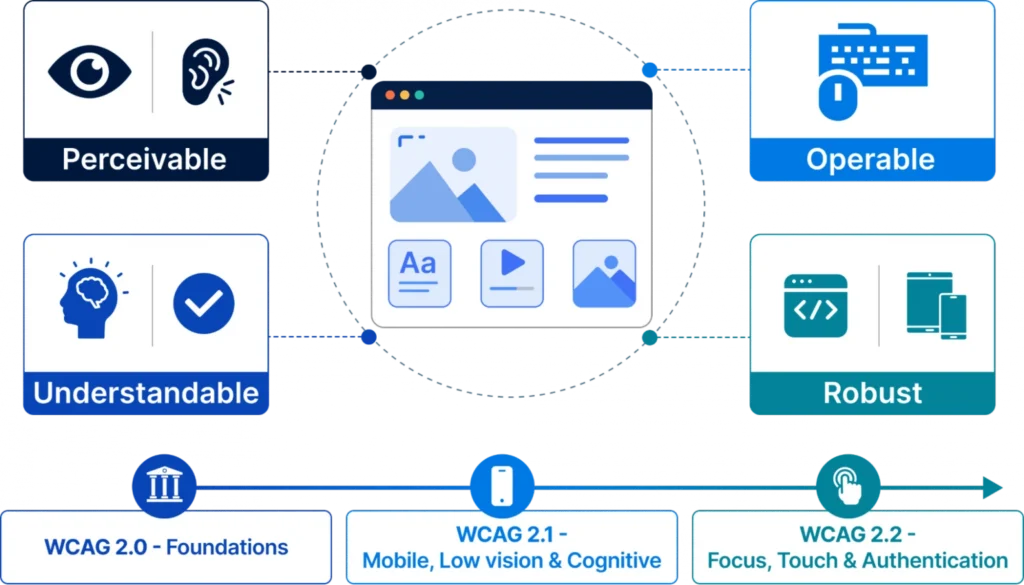
At the heart of WCAG (Web Content Accessibility Guidelines) lie four timeless principles—POUR:
- Perceivable: Can users sense the content through sight, sound, or touch?
- Operable: Can they navigate and interact effectively?
- Understandable: Is the information and interface predictable and clear?
- Robust: Does it work reliably with current and future assistive technologies?
WCAG 2.0 established these basics back in 2008. Version 2.1 (2018) added critical support for mobile, low vision, and cognitive needs, including reflow and text spacing. WCAG 2.2 (2023, with updates) builds further with nine new success criteria, such as Focus Not Obscured, Dragging Movements, Target Size (Minimum), and Accessible Authentication—addressing modern touch interfaces and cognitive load.
For most compliance needs today, WCAG 2.1 Level AA remains the gold standard referenced across major regulations. Aim here first, then layer in 2.2 enhancements for future-proofing.
Practical Engineering Priorities That Make a Difference
True accessibility starts with thoughtful implementation. Let’s walk through the essentials that transform good code into genuinely inclusive experiences.
Keyboard Navigation First: Every interactive element, like links, buttons, forms, and custom components, must be fully operable via keyboard alone. No traps that leave users stranded. Follow the ARIA Authoring Practices Guide (APG) for consistent patterns: arrows for menus and tabs, Enter/Space for activation, Escape for closing. A simple but powerful test? Unplug your mouse and complete your core user journeys. If it feels frustrating, iterate.
Color and Contrast Done Right: Meet the ratios—4.5:1 for normal text, 3:1 for large text and UI components. Don’t forget focus indicators (a WCAG 2.2 emphasis), which must remain visible and not get swallowed by overlapping elements. Tools like the Colour Contrast Analyser help validate this quickly during design and build.
Forms That Guide, Not Frustrate: Proper <label for> associations are non-negotiable—placeholders alone don’t cut it. Error messages should clearly identify fields, explain issues, and suggest fixes. WCAG 2.2’s Redundant Entry and Accessible Auth criteria push us further: avoid forcing users to re-enter data unnecessarily and provide non-cognitive authentication alternatives to CAPTCHAs.
Semantic HTML Over ARIA Overuse: Native elements win almost every time. Use real <button>, <a>, headings, and landmarks instead of styled divs with roles. This gives assistive tech exactly what it needs without an extra maintenance burden.
A Robust Testing Strategy: Beyond Automation
Automated tools like axe-core, Lighthouse, and eslint-plugin-jsx-a11y catch roughly half the issues, valuable for CI/CD but never sufficient alone. Integrate them early: lint in the IDE, run component tests in Storybook, and scan flows in pipelines.
Manual testing completes the picture. Use NVDA (with Firefox) and VoiceOver (Safari) for screen reader validation. Test keyboard flows, 200-400% zoom/reflow at narrow viewports, and real form submissions. Involve QA, designers, and even accessibility specialists throughout the lifecycle—not just at the end.
Shift-left is the efficiency secret: bake accessibility into product specs, design systems (focus states, contrast tokens), and Definition of Done for every sprint. This prevents expensive production fixes.
Accessibility testing must be distributed across the entire delivery lifecycle and not concentrated at a pre-launch QA phase. The model below maps activities to development stages:
| Stage | Activities | Tools |
|---|---|---|
| Design Phase | Review focus states, error UX, touch targets, contrast ratios in Figma/Sketch | Contrast checkers, Figma a11y plugin, inclusive design patterns |
| Development Phase | eslint-plugin-jsx-a11y in IDE; jest-axe component assertions; Storybook a11y addon | Linting tools, axe-core, Storybook |
| CI/CD Pipeline | axe-core via Playwright/Cypress on critical flows; Pa11y-ci on key URLs; AccessLint PRs | axe-core, Pa11y-ci, AccessLint GitHub Action |
| Release QA | Manual keyboard-only; NVDA+Firefox and VoiceOver+Safari on all modified flows | Screen readers, Colour Contrast Analyser |
| Production Monitoring | Scheduled scans, regression alerts, and user feedback channels for barrier reports | WAVE API, Siteimprove, Deque axe Monitor |
Manual Testing Checklist – Critical Areas
| Test Area | Methodology | Pass Criterion |
|---|---|---|
| Keyboard Navigation | Disconnect mouse; traverse all flows using Tab, Shift+Tab, Enter, Space, Arrow keys, and Esc. | All controls are reachable; no keyboard traps; correct widget interaction patterns. |
| Focus Visibility | Tab through pages with sticky headers and verify the focus ring at all states. | Focus indicator is visible and not obscured by sticky UI. |
| Screen Reader | Test critical journeys using NVDA with Firefox and VoiceOver with Safari. | Users can complete all tasks without guesswork. |
| Colour Contrast | Use Colour Contrast Analyser eyedropper on all text and UI components. | All elements meet WCAG contrast thresholds. |
| Zoom & Reflow | Test at 200% and 400% zoom and at a 320px viewport width. | No horizontal scrolling; content remains readable; no overlapping elements. |
| Forms & Validation | Submit empty and invalid forms and trigger all validation states. | Errors are announced; focus is managed correctly; all fields are properly labelled. |
Governance, Prioritization, and Long-Term Maintenance
Accessibility thrives with shared ownership. Product and design own inclusive patterns and visuals. Engineering handles semantics and behavior. QA verifies with assistive tech. Specialists guide standards and audits. Legal aligns with risk.
Prioritize fixes using a simple model: severity (task-blocking?) × frequency × breadth of impact × legal exposure. Start with those top six WebAIM failures—they offer high return on effort.
Sustain it with scheduled scans, quarterly audits, user feedback channels, and updated VPATs. Accessibility isn’t a launch-day achievement; it’s ongoing care as features evolve.
Why Web Content Accessibility Matters
Accessibility benefits far more than just people with disabilities. Features like screen reader support, keyboard navigation, captions, and clear layouts make digital experiences easier for everyone to use.
For users, accessibility improves usability for people with disabilities, older adults, individuals with temporary injuries, and anyone using different devices or environments. For organizations, it helps meet compliance requirements, reduces legal risk, expands market reach, and can improve SEO performance through better site structure and semantic markup.
Accessibility also strengthens product development. It encourages cleaner design, more intuitive user experiences, maintainable code, and consistent testing practices. The result is a better digital product that is more inclusive, efficient, and user-friendly for all.
The Human Outcome
When we build accessibility, we create products that let people participate fully with dignity and independence. Visible focus rings, predictable navigation, clear errors—these aren’t just for compliance. They make interfaces better for aging users, injured colleagues, distracted parents, and everyone in between.
The goal isn’t a flawless audit score. It’s software that works reliably for real humans using it in their own ways.
Ready to level up? Start by auditing one critical flow today. Explore the WCAG 2.2 Recommendation, WebAIM Million Report, and ARIA APG. Your users and your metrics will thank you.
Author’s Note: This article was supported by AI-based research and writing, with Claude 4.5 assisting in the creation of text and images.
Author

Praveen is a ISTQB Certified CapeStart QA professional with extensive expertise in software quality assurance and test automation. Proficient in Java, Selenium, TestNG, and Cucumber frameworks, with proven experience in designing and executing robust automated test suites, API validations, and negative scenario testing. Skilled in ensuring full test coverage, strengthening CI/CD pipelines with quality gates, and leveraging GitHub Copilot to accelerate test development and enhance delivery efficiency.
FAQ
What is the difference between WCAG 2.1 and WCAG 2.2?
WCAG 2.2 adds nine new success criteria focused on focus visibility, touch targets, dragging, cognitive accessibility, and authentication, while remaining backward compatible. Most organizations target 2.1 AA for compliance but adopt 2.2 best practices.
Is WCAG 2.1 Level AA enough for ADA compliance in 2026?
Yes, the DOJ’s Title II rule references WCAG 2.1 AA, with compliance deadlines phased through 2027-2028 for many entities. However, aligning with 2.2 is recommended for future-proofing.
How do I test for keyboard accessibility effectively?
Disconnect your pointing device and navigate all key journeys using Tab, Shift+Tab, arrows, Enter, Space, and Esc. Ensure no traps and proper widget behaviors per ARIA APG.
What are the most common accessibility errors on websites?
Low contrast text, missing alt text, missing form labels, empty links/buttons, and missing document language—fixing these addresses the vast majority of issues.
Do I need ARIA for every custom component?
Prefer native HTML elements whenever possible. Use ARIA only when necessary, and always follow established patterns to avoid creating more problems.
How can accessibility improve my site's SEO and performance?
Semantic markup, proper headings, alt text, and landmarks help search engines understand content better, often leading to improved rankings and clearer user experiences.
Where should a team new to accessibility begin?
Start with keyboard navigation and contrast audits on high-traffic pages. Integrate axe-core into your CI pipeline, train designers on inclusive patterns, and adopt shift-left practices in your workflow.